Central Limit Theorem Simulation
Alex Fennell
Simulating the Exponential distribution
Synopsis
This project will compare how statistics of a non-normal distribution are themselves normally distributed. Samples will be drawn from the exponential distribution to generate the mean and variance. The distribution of these statistics will then be compared to the theoretical mean and standard deviation of the distribution. The simulated distributions of statistics will then be compared to a normal distribution to see if the statistics derived from a skewed distribution are themselves normally distributed. Code is contained in an appendix following the report.
Simulations
This simulation will use samples of size 40 with lambda=.2. There will be 1000 simulations used to create a distribution
Sample Statistics vs. Theoretical Statistics
The first thing to be examined is a histogram of the means/variances
from the
simulation with the theoretical mean/variance overlayed as a dashed red
vertical line. The theoretical mean is calculated as 1/lambda while the
theoretical variance is calculated as 1/lambda^2
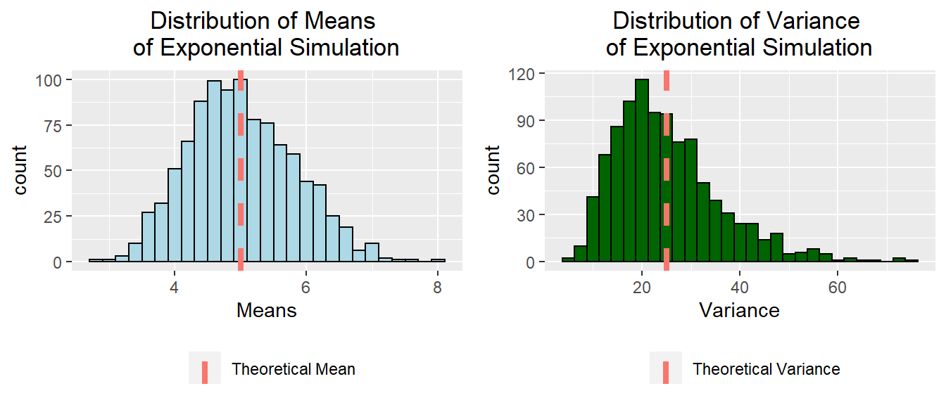
The histogram on the left shows that the distibution of means sampled from the exponential distribution is roughly normal with the highest density of responses centered around the theoretical mean (vertical red dashed line). The histogram on the right shows the right skew of the simulated variance. The theoretical variance (vertical red dashed line) lies to the right of the highest density in the plot.
Exact Theoretical and Simulated Statistics
The actual values of the theoretical and simulated means and varinaces are presented below. The simulated values are incredibly close to the theoretical values for both mean and variance.
##                    Statistic     Value
## 1           Theoretical Mean  5.000000
## 2             Simulated Mean  5.020674
## 3       Theoretical Variance 25.000000
## 4 Average Simulated Variance 25.078391
Normality of Simulated Statistics
I will now examine the distribution of the mean, and variance, of the Monte Carlo Simulations to see how close they approximate a normal distribution and conform to the central limit theorem. I will do this in two ways. The first is to overlay a normal PDF (black curve) on the histograms, and the second is to use a QQ plot. The QQ plot provides a very obvious comparison of data to the theoretical normal distribution. Simulated data that does not fall on the diagonal reference line does not conform to a normal distribution, with larger deviations indicating a greater departure from normality.The dark gray region surrounding the diagonal reference line is a 95% confidence interval so as to indicate how much the simulated data differs or conforms to a normal distribution.
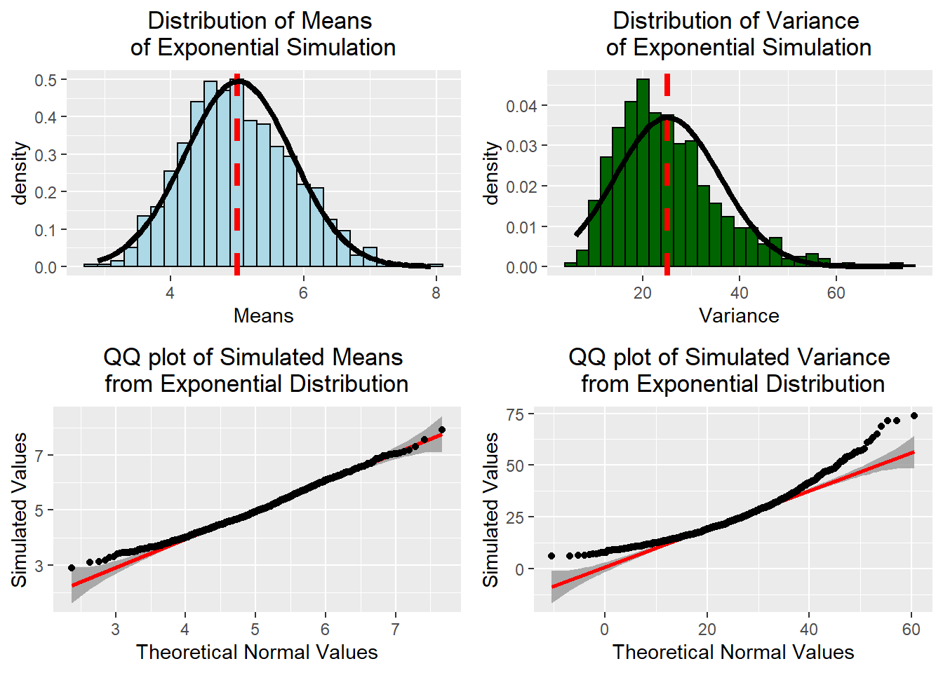
The plots in the left column of this figure show that the distribution of simulated means approximates a normal distribution with the exception of a few values. On the other hand, the plots in the right column show the distribution of simulated variances is highly skewed and deviates from normality.The QQ plot shows that the simulated variances deviate both in the leading edge of the distribution and the tail of the distribution. This is because the sample size used in the simulation (n=40) is too small of a sample for variance to conform to a normal distribution as the central limit theorem states. Variance is heavily influenced by skewed distribution, and given the heavily skewed nature of the exponential distribution this result is not surprising. For the interested reader, in the appendix, I will re-run the simulation with a larger sample and demonstrate how this produces a normally distributed variance.
Exponential Simulation with Large Sample Size
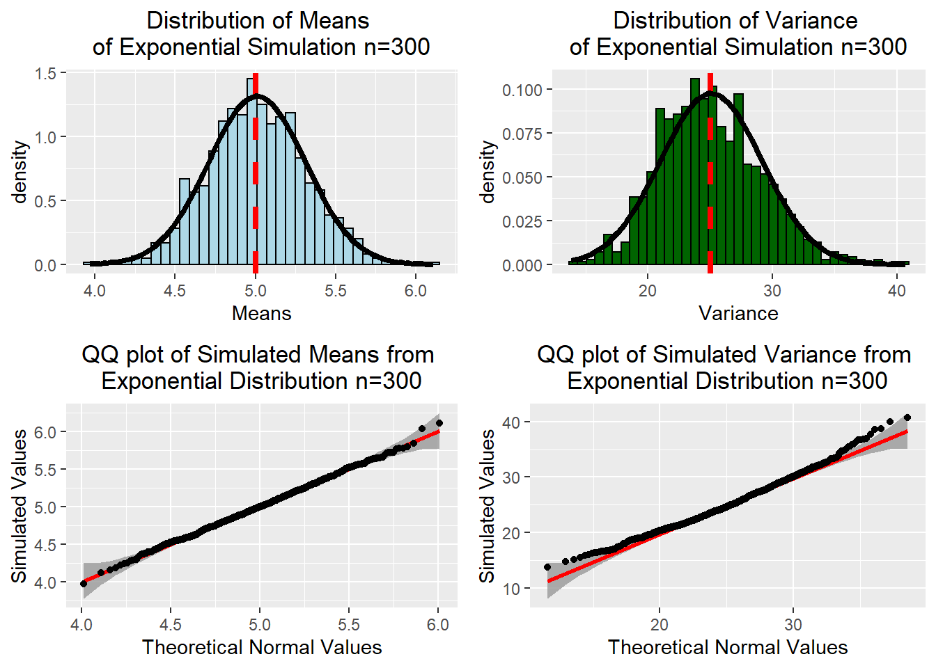
With 300 samples in each simulation, both the distributions of simulated means and variances appear to be normally distributed. The pdf of the normal distribution (black curve) overlays the histogram of simulated values and conforms quite well. In the QQ plot most all values for the simulated means and variances fall within the 95% confidence interval (dark grey area) indicating the distributions of simulated means and variances are normally distributed. It can also be observed that spread of the simulated means and variances is much more concentrated around the true theoretical values in comparison to the previous simulations with n=40. This is an excellent demonstration of the power of the central limit theorem.
Appendix
knitr::opts_chunk$set(echo=FALSE)
library(ggplot2)
library(gridExtra)
library(cowplot)
library(qqplotr)
set.seed(11111)
lambda=.2
#Number of samples
S=1000
#size of samples
n=40
#samples stored in matrix where columns are the size of the samples
#and each row is an individual simulation
sim<-matrix(rexp(n*S,lambda),nrow=S,ncol=n)
# Theoretical mean
Tmean<-1/lambda
Tmean<-data.frame(Type="Theoretical Mean",val=Tmean)

# The function rowMeans calulates the mean for each row (one simulation), which
#creates a distribution of means based on the simulation
simmean<-data.frame(means=rowMeans(sim))
# standardize bin width for all plots
binsize=.2
#combine mean and theoretical mean into one dataframe
meanplot<-ggplot(data=simmean,aes(means))+
    ggtitle("Distribution of Means \nof Exponential Simulation") +
    xlab("Means")+
    theme(plot.title = element_text(hjust = 0.5),
          legend.title=element_blank(),
          legend.position="bottom")

meanplot1<-meanplot+geom_histogram(aes(y=..count..),binwidth = binsize,color="black",fill="lightblue")+
    geom_vline(data=Tmean,aes(xintercept=val,color=Type),linetype="dashed",size=1.5)
#Theoretical variance
Tvar<-(1/lambda^2)
Tvar<-data.frame(Type="Theoretical Variance",val=Tvar)
# Using the apply function to calculate the variance for each row (one simulation),
# which creates a distribution of simulated variances
simvar<-data.frame(VAR=apply(sim,1,var))

varplot<-ggplot(data=simvar,aes(VAR))+
    ggtitle("Distribution of Variance \nof Exponential Simulation") +
    xlab("Variance")+
    theme(plot.title = element_text(hjust = 0.5),
          legend.title=element_blank(),
          legend.position="bottom")

varplot1<-varplot+
    geom_histogram(aes(y=..count..),binwidth=2.5,color="black",fill="darkgreen")+
    geom_vline(data=Tvar,aes(xintercept=val,color=Type),linetype="dashed",size=1.5)

# the grid.arrange function is used to organize multiple plots in a figure
grid.arrange(meanplot1,varplot1,ncol=2)
statcompare<-data.frame(Statistic=c("Theoretical Mean","Simulated Mean",
                                    "Theoretical Variance", "Average Simulated Variance"),
                        Value=c(1/lambda,mean(simmean$means),1/lambda^2,mean(simvar$VAR)))
statcompare
#Creating histogram of simulated means with normal pdf overlayed
    meanplot2<-meanplot+
    geom_histogram(aes(y=..density..),binwidth = binsize,color="black",fill="lightblue")+
    geom_vline(data=Tmean,aes(xintercept=val),color='red',linetype="dashed",size=1.5)+
    stat_function(fun=dnorm,lwd=1.5,args=list(mean=mean(simmean$means),
                                              sd=sd(simmean$means)))

#Creating histogram of simulated variances with normal pdf overlayed
    varplot2<-varplot+
    geom_histogram(aes(y=..density..),binwidth=2.5,color="black",fill="darkgreen")+
    geom_vline(data=Tvar,aes(xintercept=val),color='red',linetype="dashed",size=1.5)+
        stat_function(fun=dnorm,lwd=1.5,args=list(mean=mean(simvar$VAR),
                                              sd=sd(simvar$VAR)))

# The stat_qq_* functions are from the qqplotr package and generate a 95% confidence
# interval around a reference line that indicates normality.

    qqmeanplot<-ggplot(simmean,aes(sample=means))+
        stat_qq_band()+
        stat_qq_line(color='red',lwd=1)+
        stat_qq_point() +
        labs(title="QQ plot of Simulated Means \nfrom Exponential Distribution") +
        xlab("Theoretical Normal Values")+ylab("Simulated Values")+
        theme(plot.title = element_text(hjust = 0.5))

    qqvarplot<-ggplot(simvar,aes(sample=VAR))+
        stat_qq_band()+
        stat_qq_line(color='red',lwd=1)+
        stat_qq_point() +
        labs(title="QQ plot of Simulated Variance \nfrom Exponential Distribution") +
        xlab("Theoretical Normal Values")+ylab("Simulated Values")+
        theme(plot.title = element_text(hjust = 0.5))

      grid.arrange(meanplot2,varplot2,qqmeanplot,qqvarplot,nrow=2,ncol=2)

#I will still use the same number of simulations for this exercise
#size of samples
n=300
#Simulation
set.seed(11111)
sim2<-matrix(rexp(n*S,lambda),nrow=S,ncol=n)
#Calculating means and variances using the newly simulated data
simmean2<-data.frame(means=rowMeans(sim2))
simvar2<-data.frame(VAR=apply(sim2,1,var))
simsd2<-data.frame(SD=apply(sim2,1,sd))

binsize=.06
#New plot for the distribution of simulated means with n=300
meanplot3<-ggplot(data=simmean2,aes(means))+
    ggtitle("Distribution of Means \nof Exponential Simulation n=300") +
    xlab("Means")+
    theme(plot.title = element_text(hjust = 0.5),
          legend.title=element_blank())+
    geom_histogram(aes(y=..density..),binwidth = binsize,color="black",fill="lightblue")+
    geom_vline(data=Tmean,aes(xintercept=val),color='red',linetype="dashed",size=1.5)+
    stat_function(fun=dnorm,lwd=1.5,args=list(mean=mean(simmean2$means),
                                              sd=sd(simmean2$means)))


varplot3<-ggplot(data=simvar2,aes(VAR))+
    ggtitle("Distribution of Variance \nof Exponential Simulation n=300") +
    xlab("Variance")+
    theme(plot.title = element_text(hjust = 0.5),
          legend.title=element_blank())+
    geom_histogram(aes(y=..density..),binwidth=.7,color="black",fill="darkgreen")+
    geom_vline(data=Tvar,aes(xintercept=val),color='red',linetype="dashed",size=1.5)+
        stat_function(fun=dnorm,lwd=1.5,args=list(mean=mean(simvar2$VAR),
                                              sd=sd(simvar2$VAR)))


qqmeanplot2<-ggplot(simmean2,aes(sample=means))+
        stat_qq_band()+
        stat_qq_line(color='red',lwd=1)+
        stat_qq_point() +
        labs(title="QQ plot of Simulated Means from \nExponential Distribution n=300") +
        xlab("Theoretical Normal Values")+ylab("Simulated Values")+
        theme(plot.title = element_text(hjust = 0.5))


qqvarplot2<-ggplot(simvar2,aes(sample=VAR))+
        stat_qq_band()+
        stat_qq_line(color='red',lwd=1)+
        stat_qq_point() +
        labs(title="QQ plot of Simulated Variance from \nExponential Distribution n=300") +
        xlab("Theoretical Normal Values")+ylab("Simulated Values")+
        theme(plot.title = element_text(hjust = 0.5))

grid.arrange(meanplot3,varplot3,qqmeanplot2,qqvarplot2,nrow=2,ncol=2)